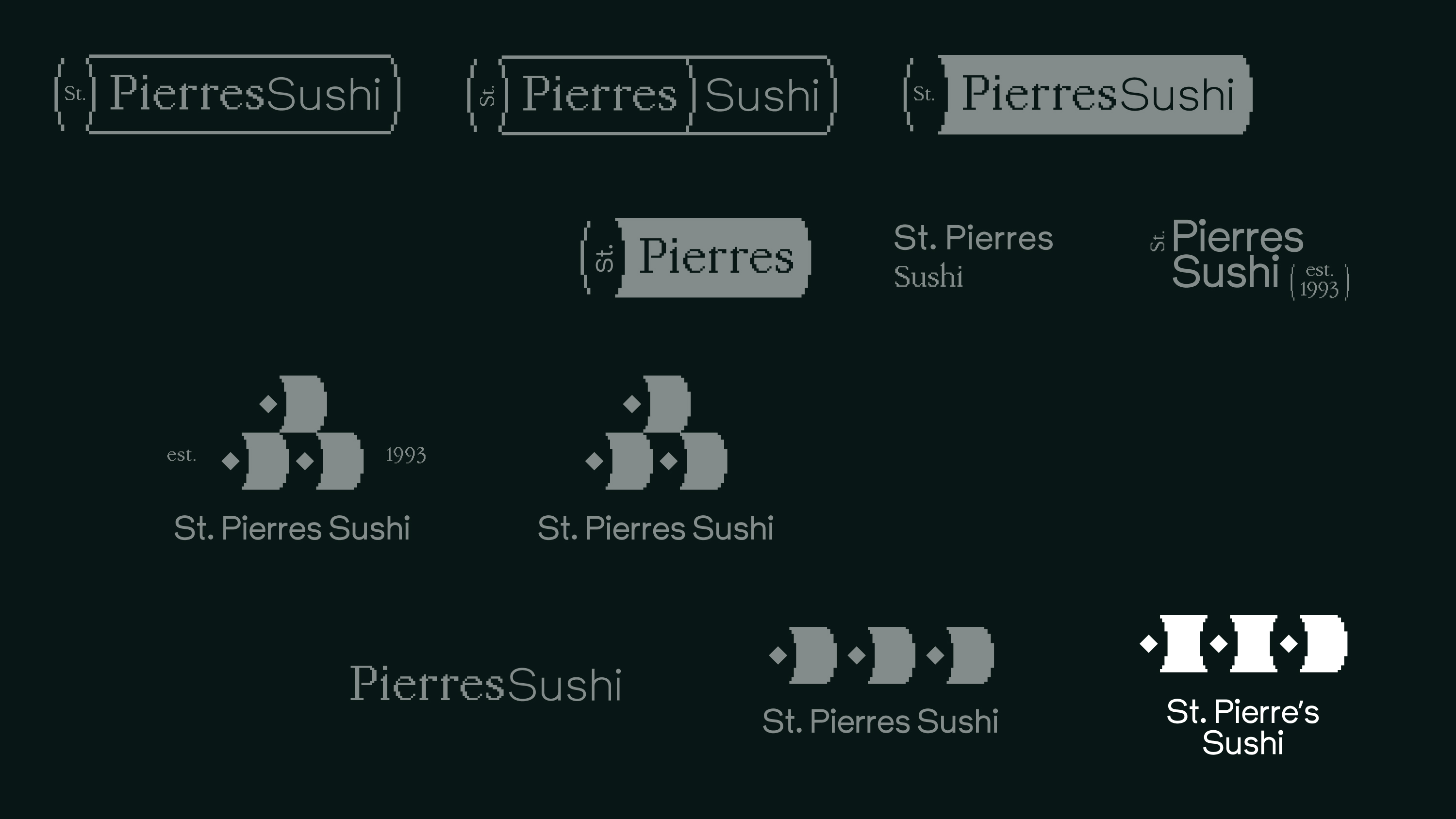
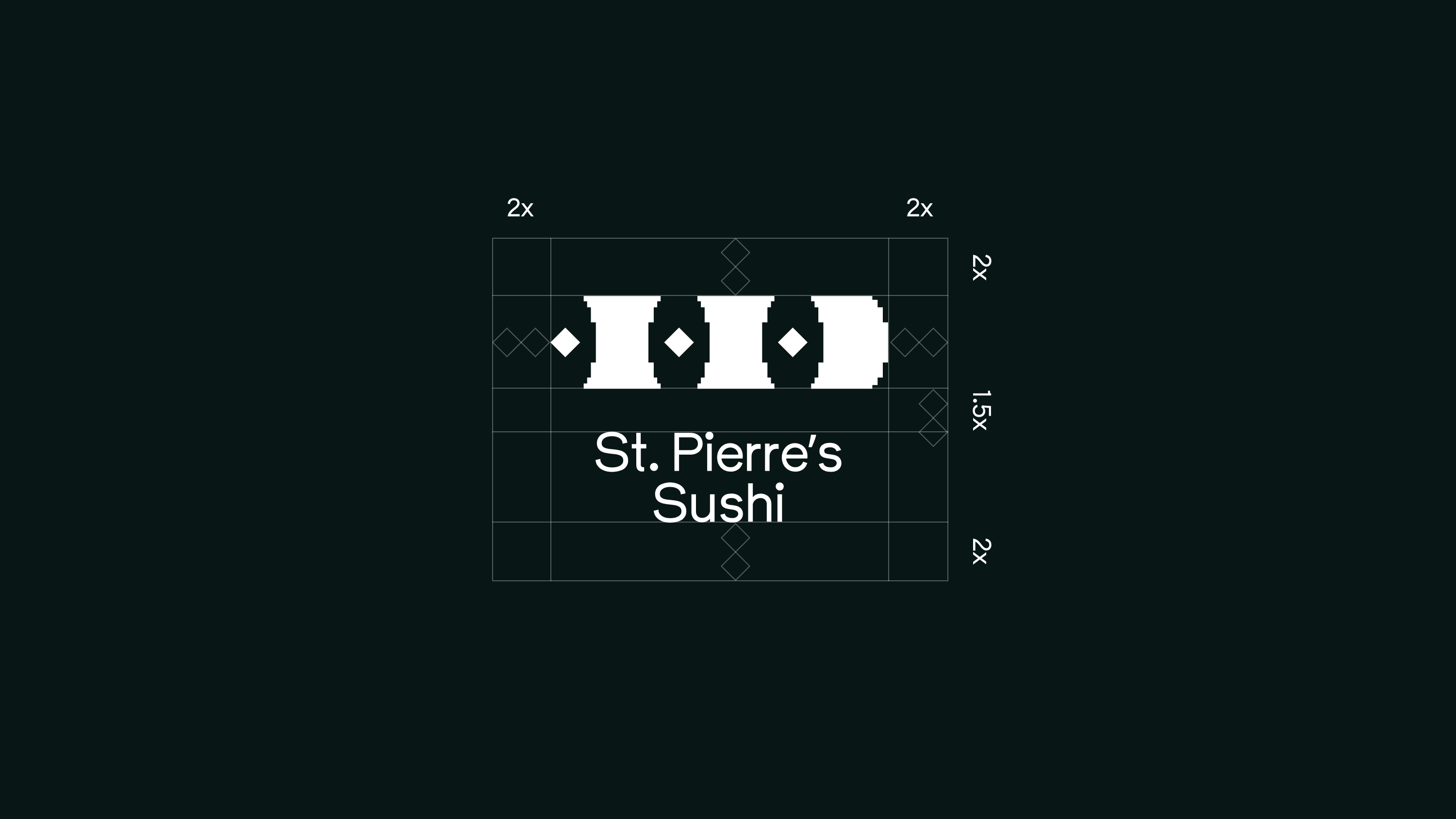
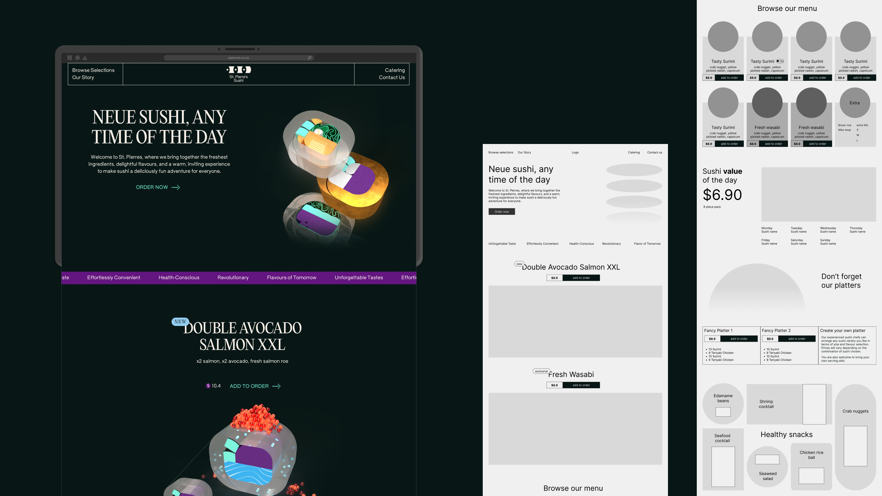
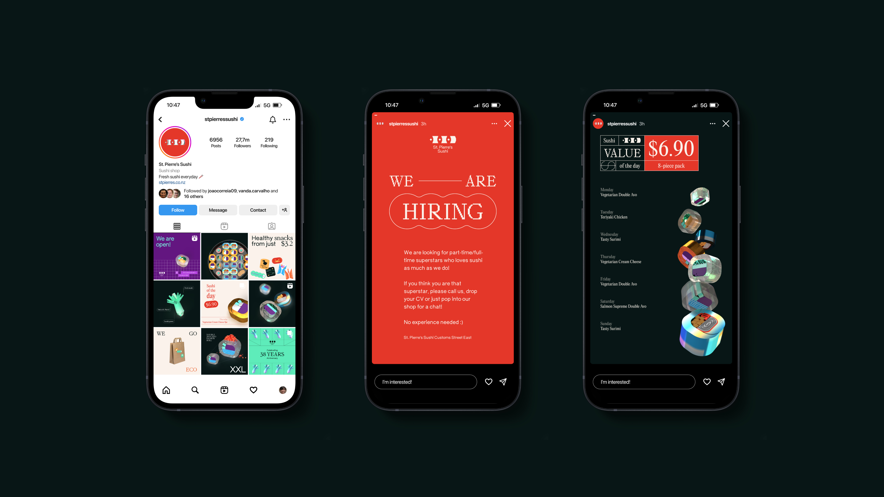
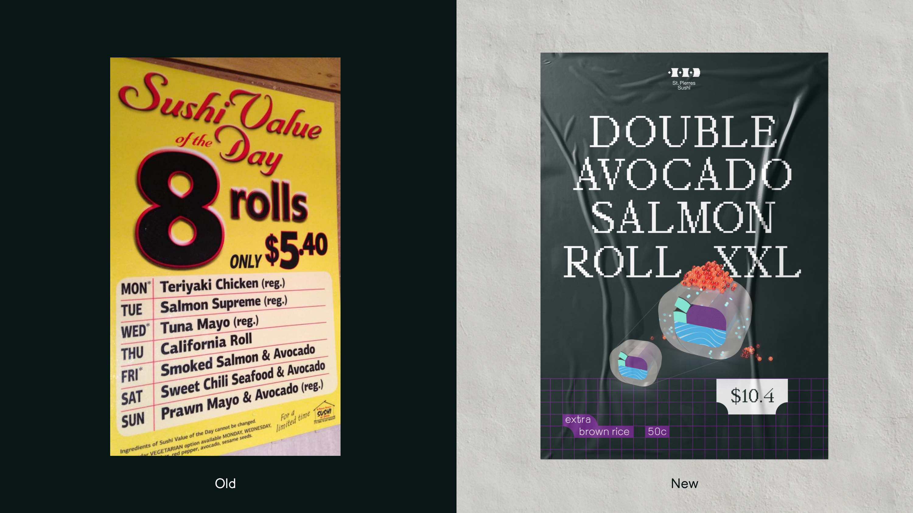
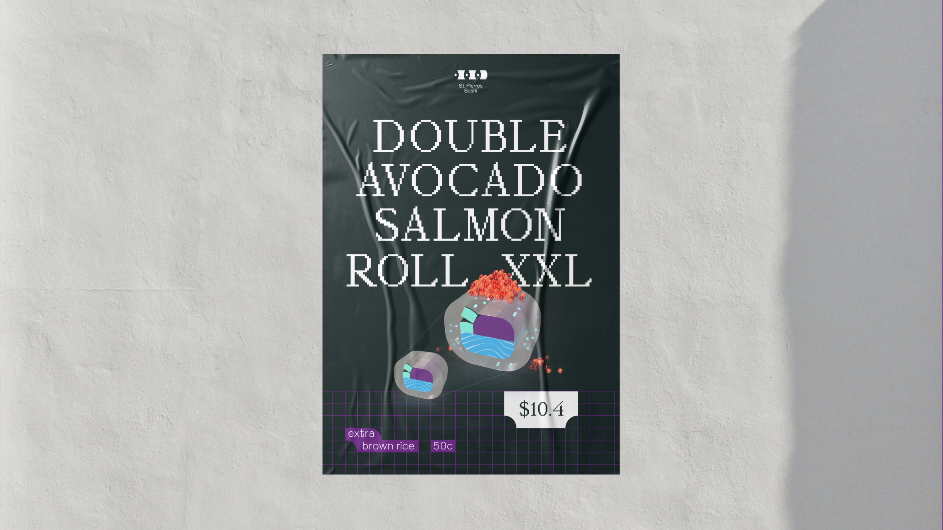
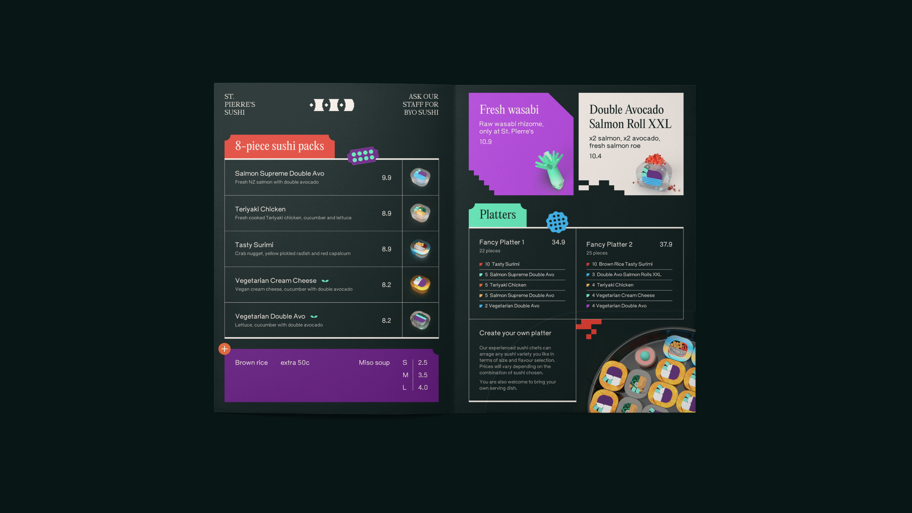
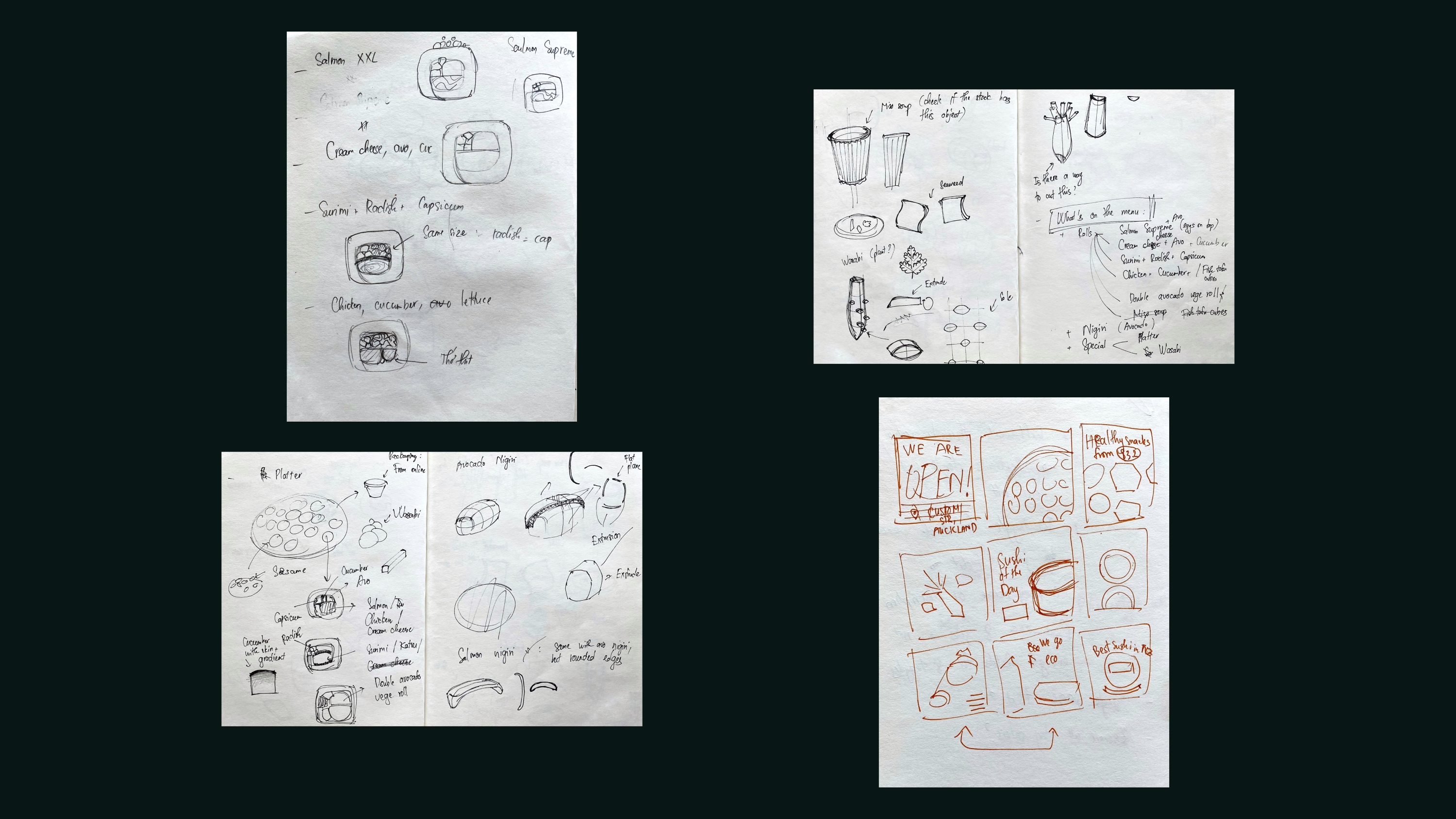
Established in 1993, St. Pierre's Sushi has always been a big name in New Zealand's food industry. However, after working with them for a long time, I realised their look and feel would need an uplift. It is undeniably eye-catching and effective, especially when it comes to the large vivid yellow billboards across the country; however a revamp could be considered to catch up with current trends and the younger generations.
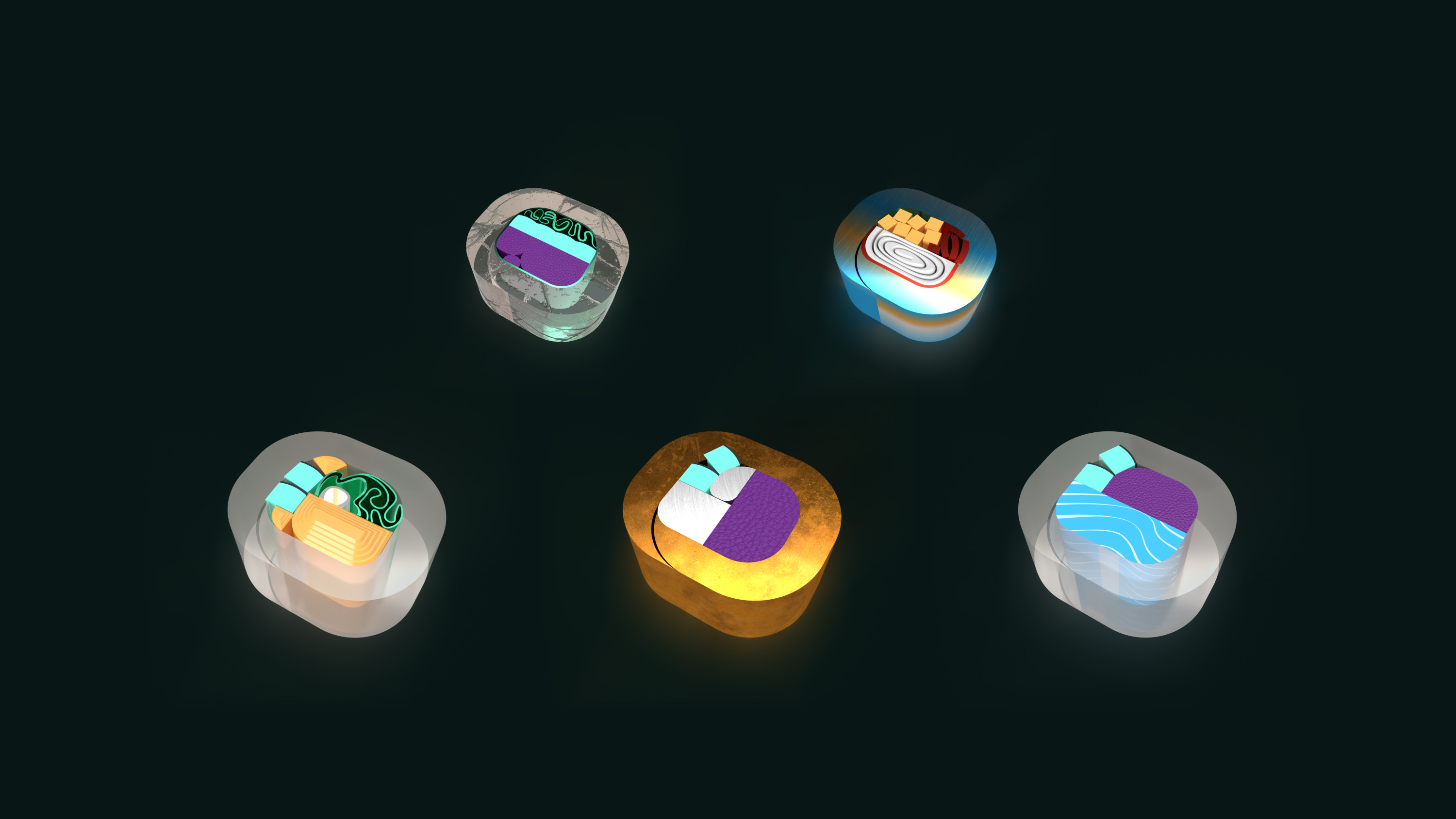
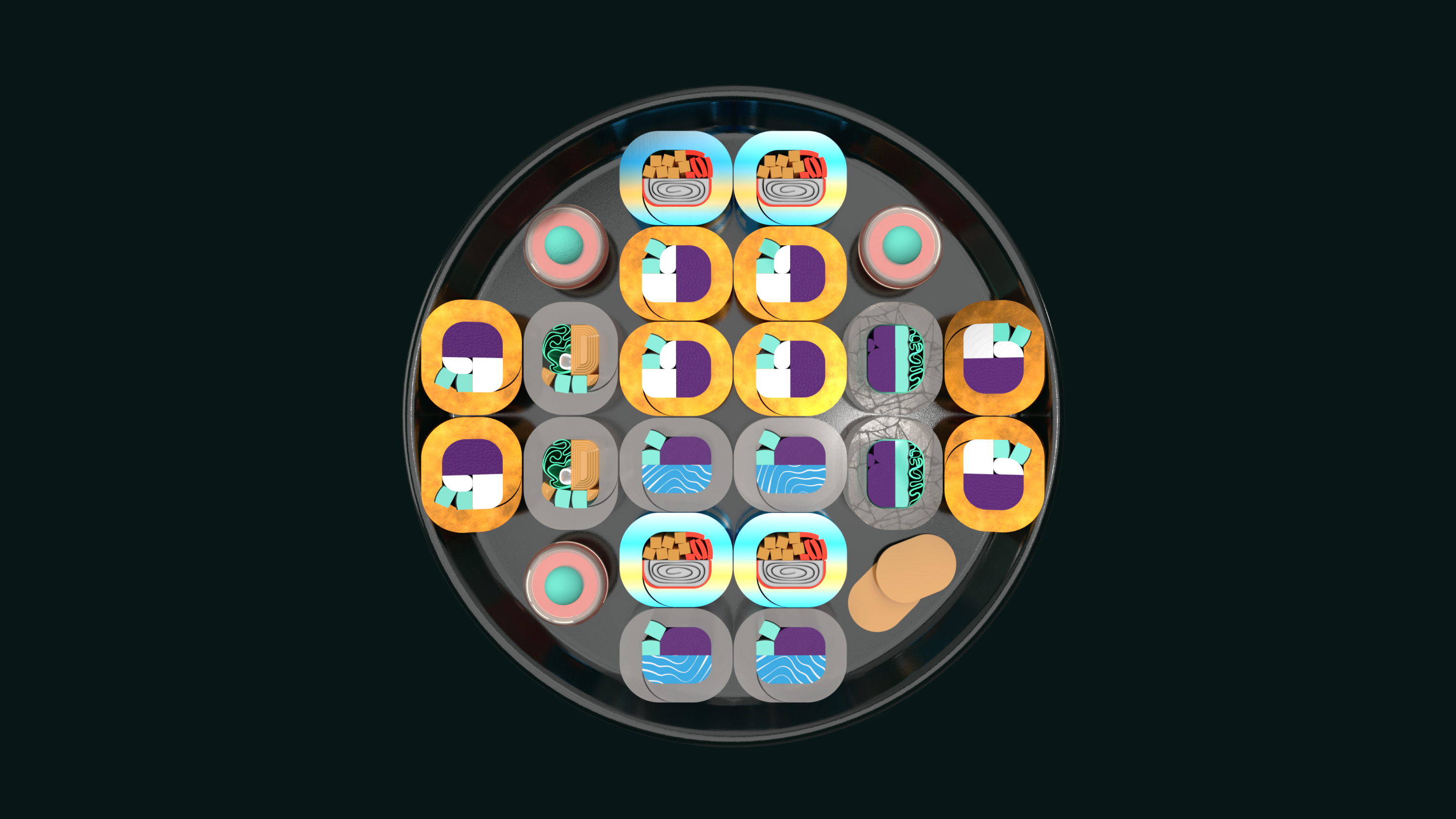
From my experience in the kitchen and the front area, I was keen to improve the design of menu, posters, colour scheme and more. Their food stickers have outdated fonts and designs and are hard to peel, which affects customer experience - that is why I recreated them using simpler edges and smoothed corners to improve the aesthetics and usability.
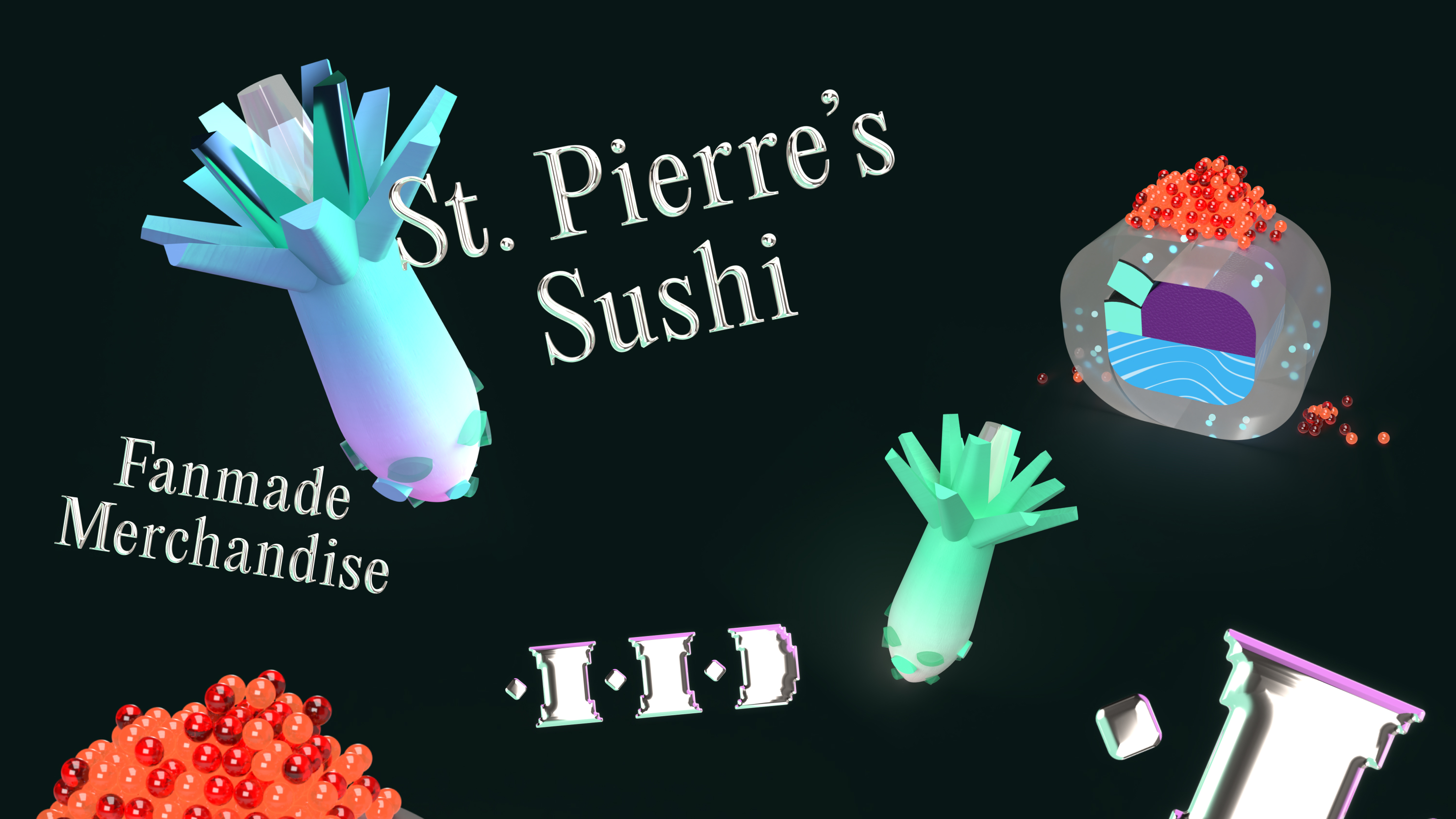
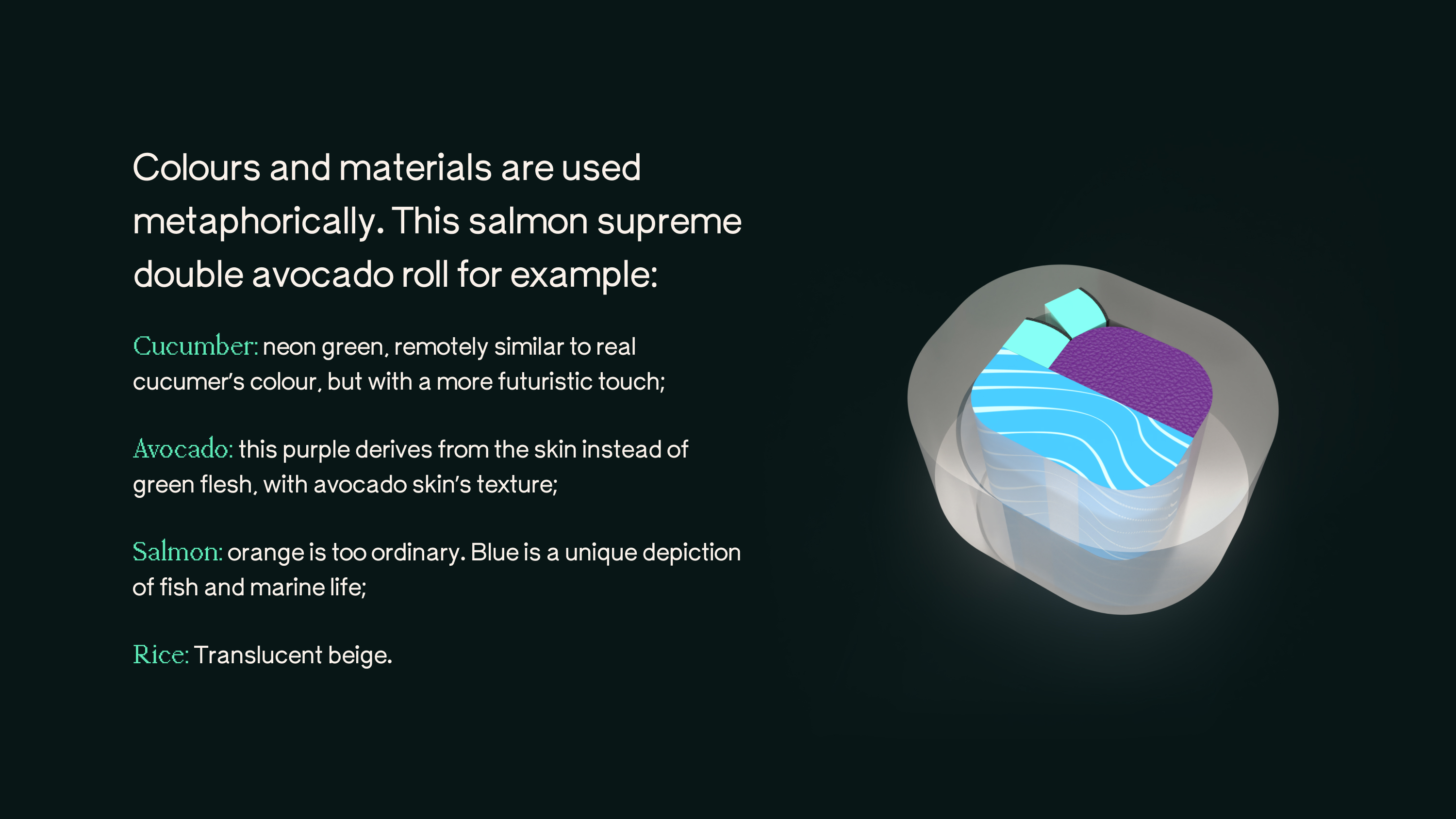
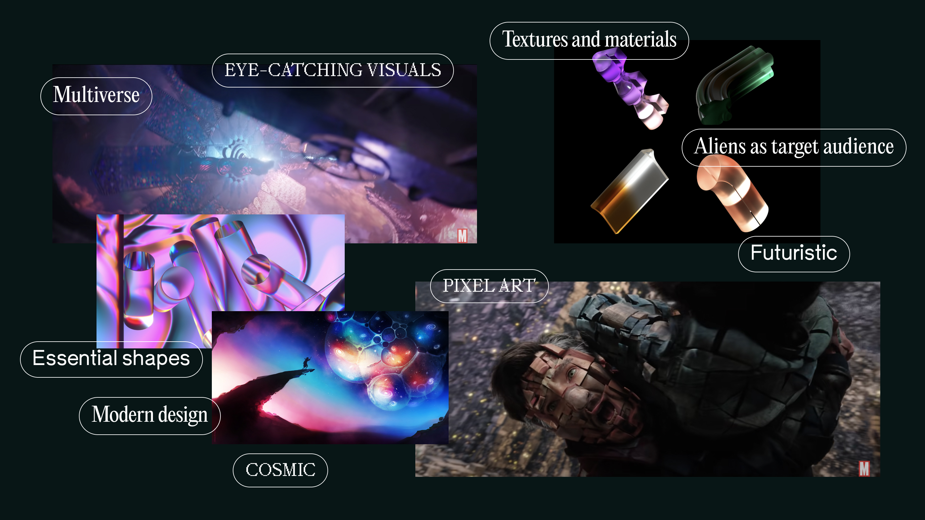
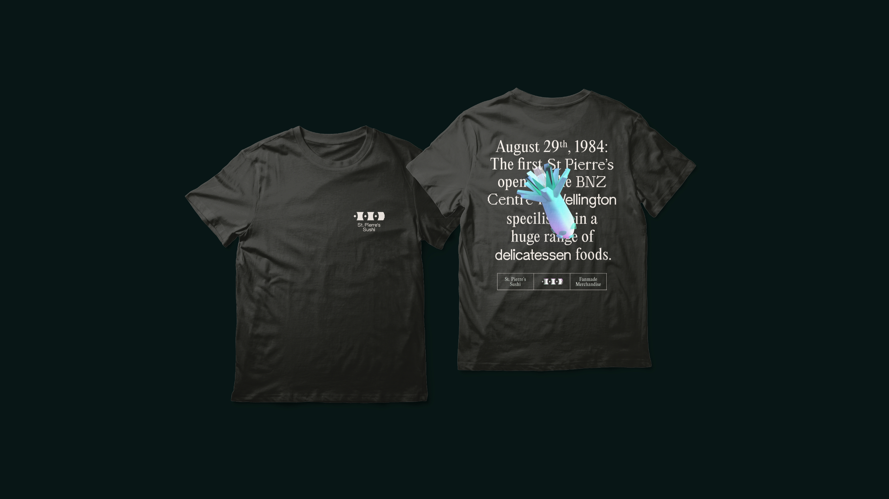
This passion project is a combination of my ideas for a sushi chain, and my favourite movie ever: Dr. Strange in the Multiverse of Madness. Together, they have formed a unique, futuristic branding.