At Fujee Design Studio, I had the opportunity to leverage my skills and creativity for birkads.com—an elite platform for Facebook advertising aimed at ambitious green outdoor brands. Our product development process followed a proven framework: research, wireframing, high-fidelity mockups, Webflow prototyping, and testing, all enriched by a variety of engaging challenges and valuable insights.

Over the past decade, Madis Birk has assisted hundreds of high-growth brands in enhancing their sales through exceptional advertising campaigns. In addition to serving as a consultant for Hootsuite, the world’s largest advertising platform, AdEspresso, and Madgicx, he also coaches billion-dollar companies and individuals. Now, driven by a passion for the creative aspects of paid media, Madis has established BirkAds—a growth partner focused on developing Ad Creative Research (ACR) systems specifically for green outdoor brands.
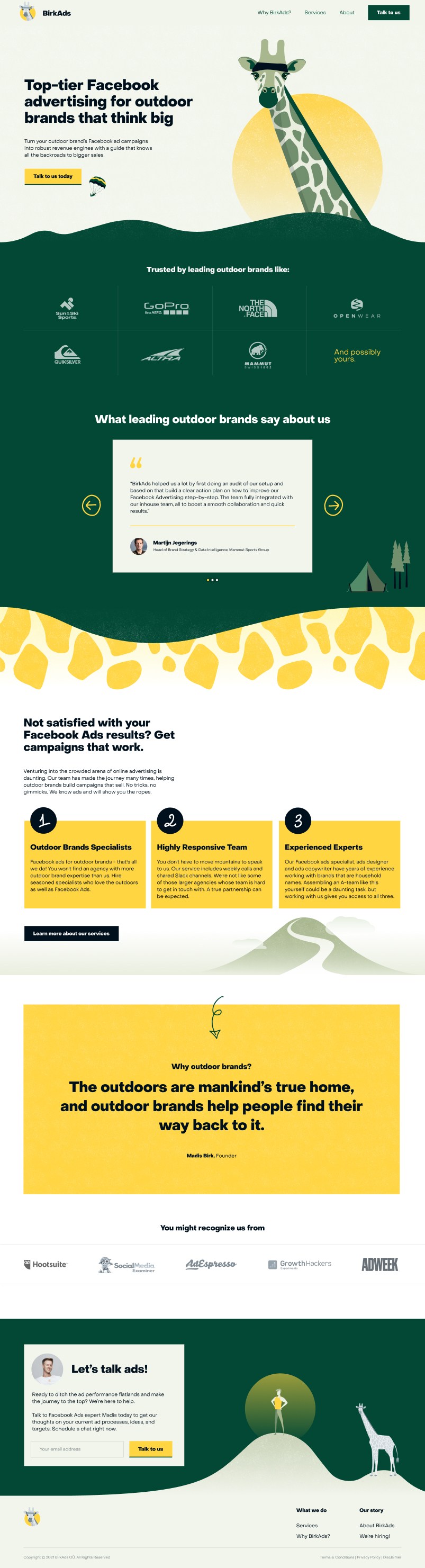
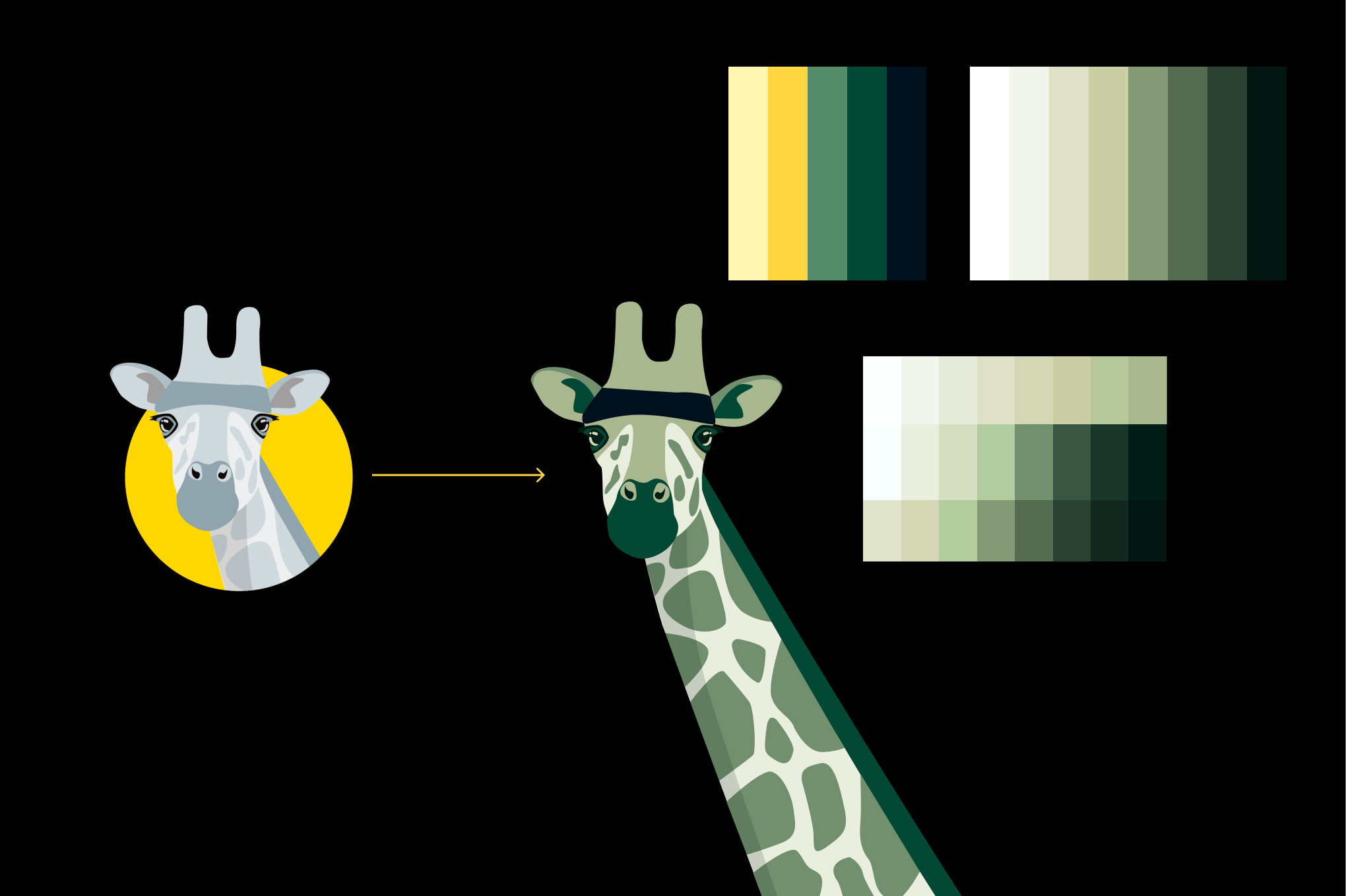
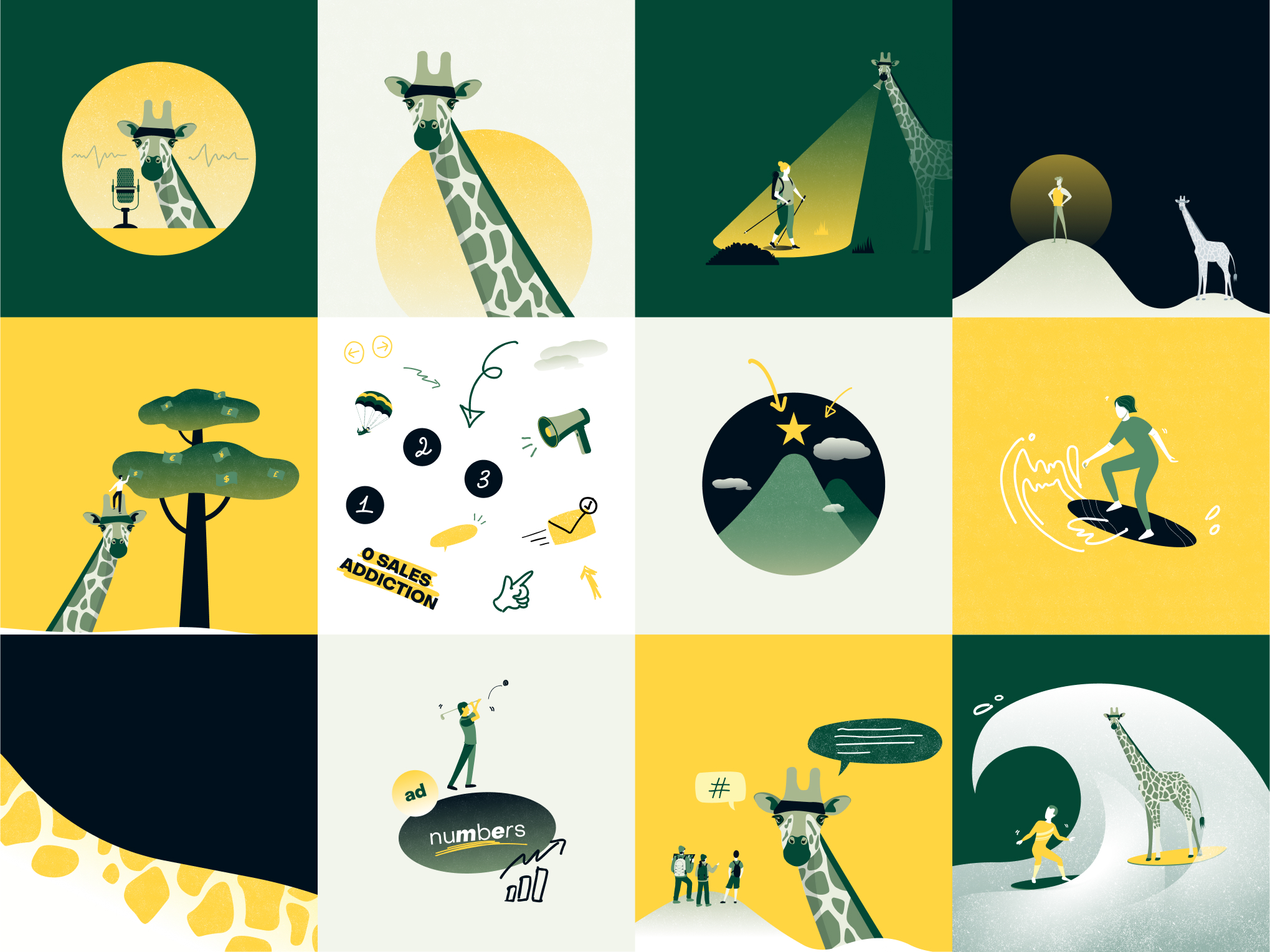
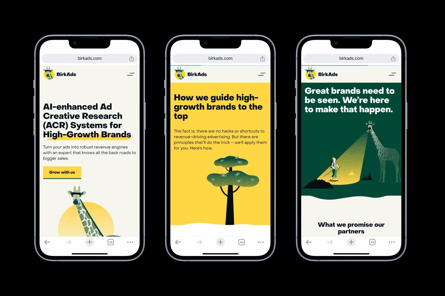
Madis approached us with a newly created brand identity centred around the giraffe, the tallest animal, symbolising the potential to uncover often-overlooked opportunities. The website needed to reflect the founder's vision and showcase what BirkAds can deliver to its clients.
As part of a close-knit team, I was involved in every stage of the project: discovery calls, client communications, gathering feedback, brainstorming, wireframing, creating high-fidelity mockups, and developing in Webflow, all with guidance from our Creative Director.
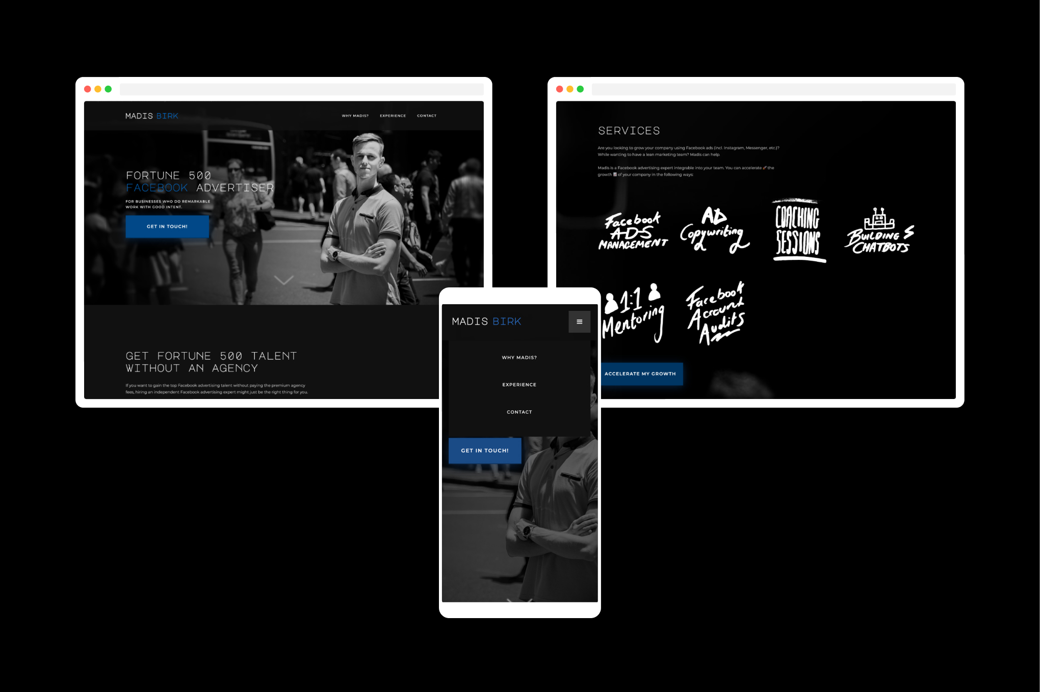
The previous website presented several challenges:
Addressing these issues was crucial for establishing a stronger online presence.
Defining the Scope
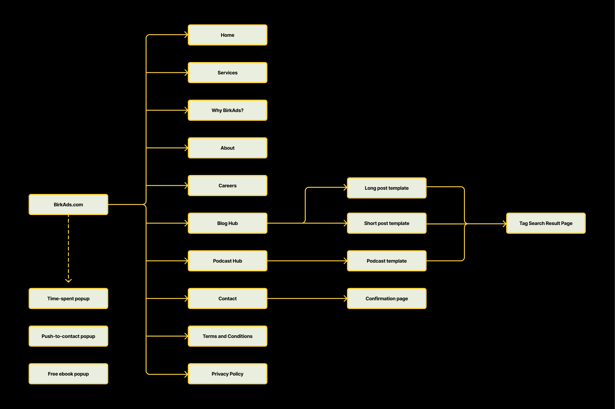
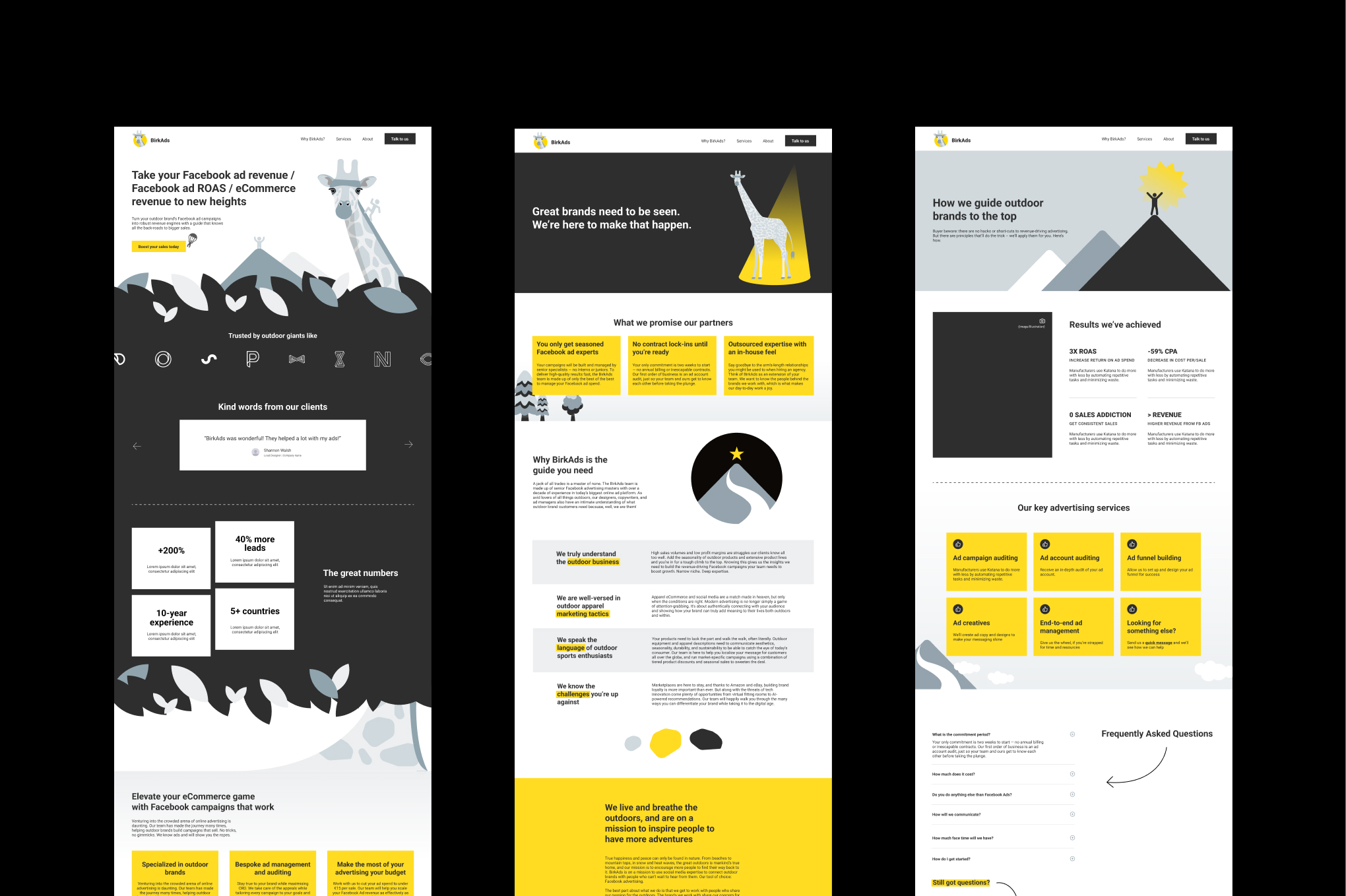
Our team conducted extensive research into the client’s industry, needs, and pain points, ultimately defining a scope of work that encompassed 15 pages and 3 popups.
Site Structure, Design and Development
Wireframes:
My initial wireframes were overly detailed, resulting in extended timelines and numerous revisions. Simplifying the wireframes by removing extraneous brand elements would have expedited the process, particularly given the time spent on creating effective layouts based on Madis’s input.
Colour Scheme:
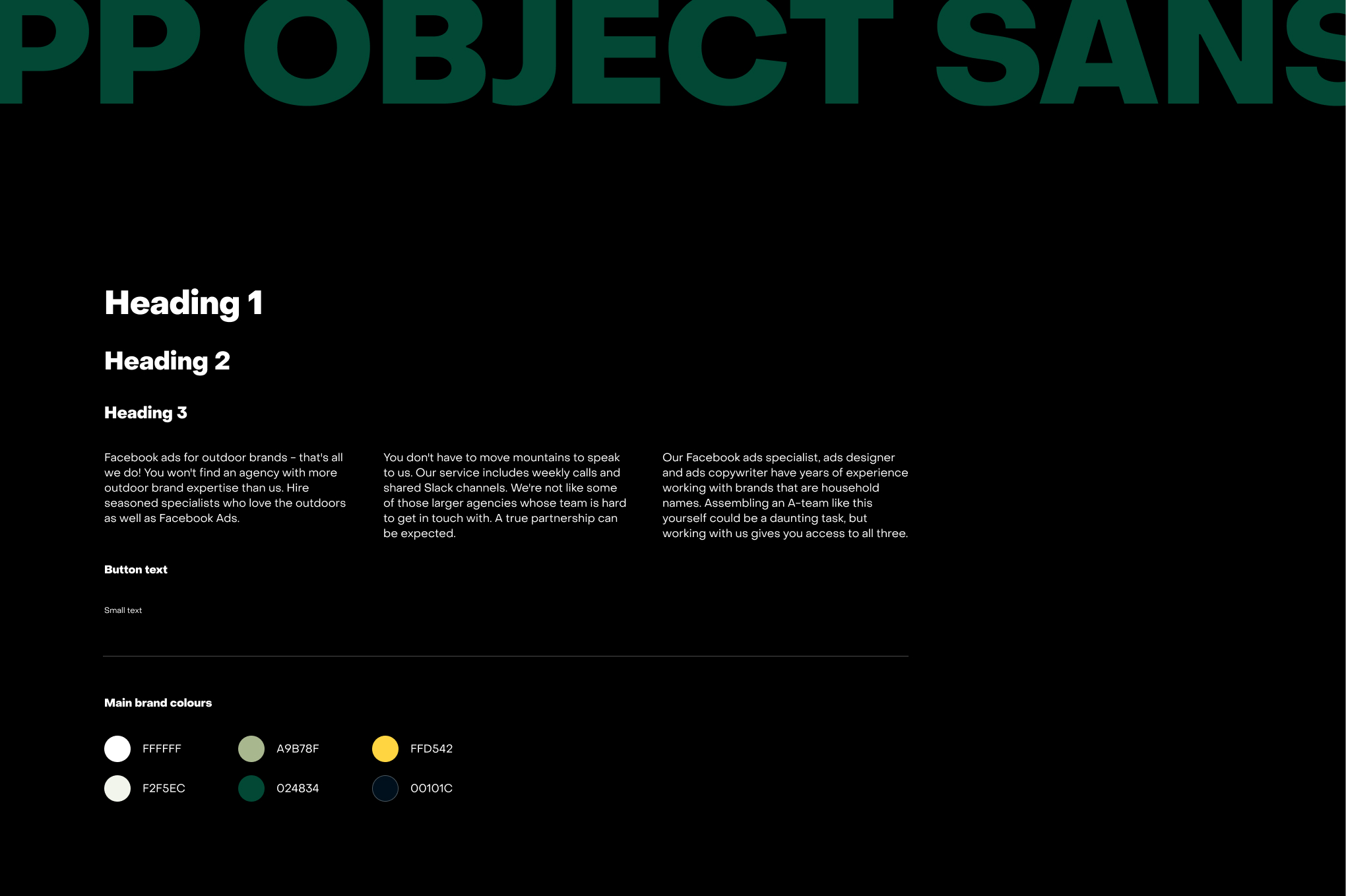
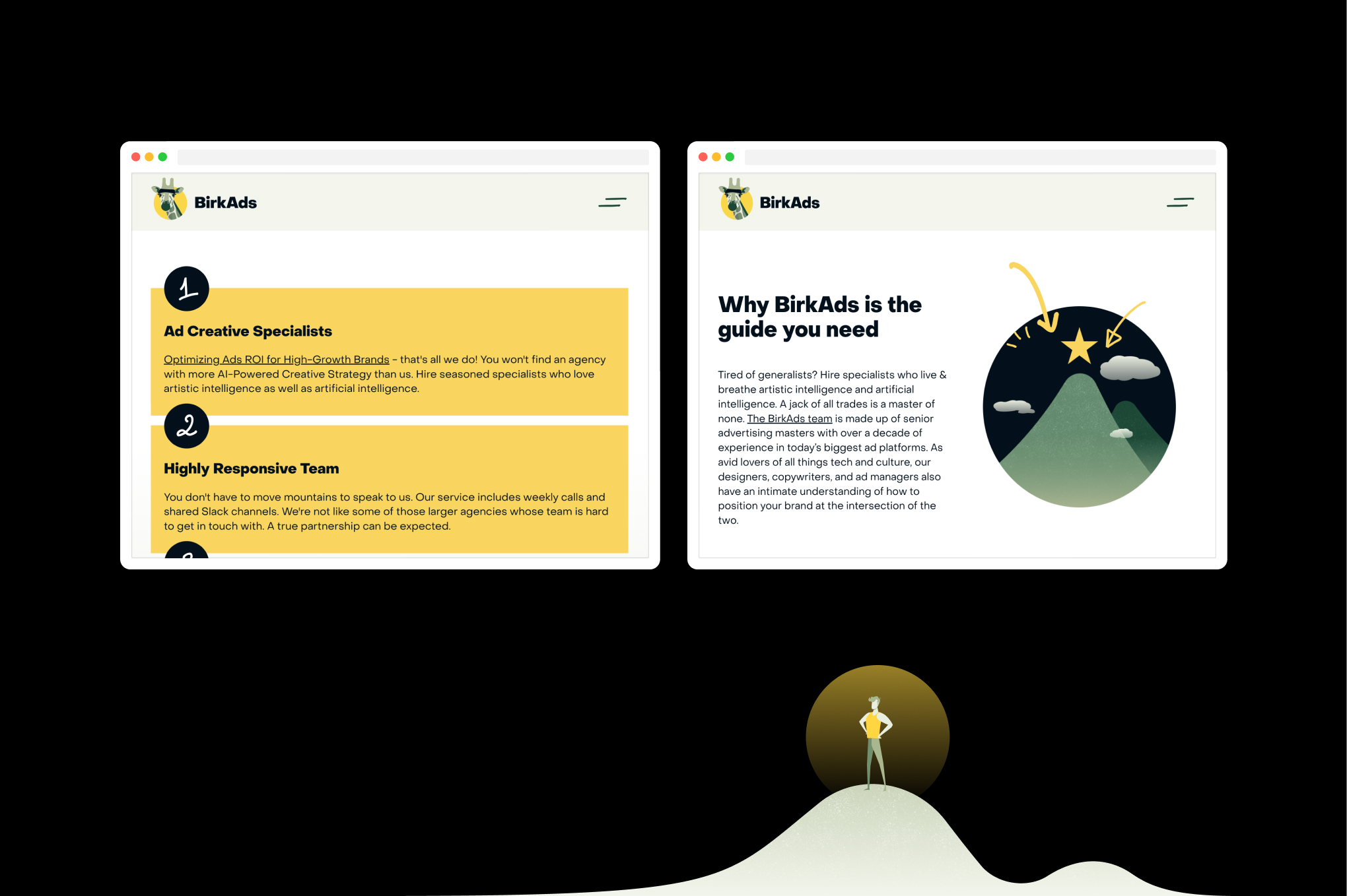
We expanded BirkAds’ original colour palette to create a versatile system allowing for various combinations. Through discussions with the client and his design team, we replaced dull greys with vibrant shades of yellow and green, representing nature and adventure. The new colours ensure good contrast between text and background, enhancing usability and accessibility.
Typography:
We selected Object Sans from Pangram Pangram for its contemporary aesthetic and versatility. Adjustments to kerning and line spacing maximised readability, while lengthy passages were broken into smaller, more digestible sections, with noticeable size differences in headings to establish a clear hierarchy.
Designing and Building the Page
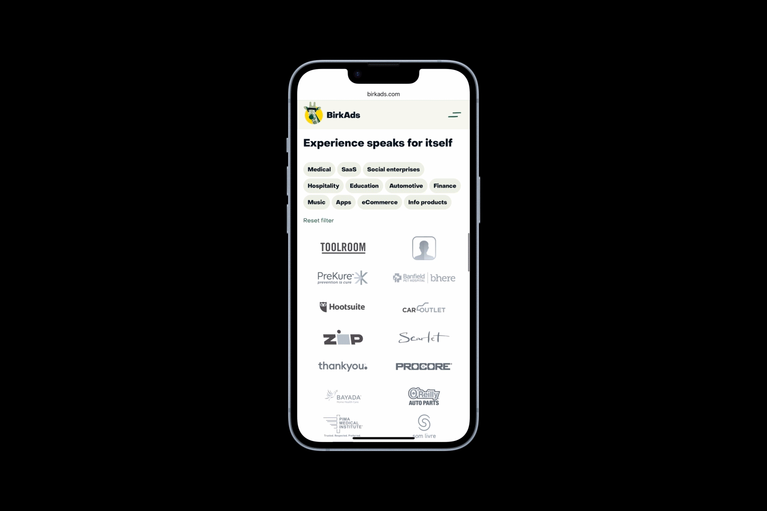
Client Logos and Testimonials:
We prominently featured logos and selected testimonials to build trust. With over 50 brands to showcase, we employed the Finsweet plugin to categorise them. A key challenge was to streamline the user experience for Madis, ensuring he could easily update logos despite lacking design or development skills. I created a Figma template for logo updates and recorded Loom videos to guide him through the Webflow CMS process, enhancing my presentation skills in the process.
Call-to-Action Buttons and Anchor Links:
We proposed varied wording for buttons and strategically positioned anchor links to guide users without appearing overly repetitive. Integrating underlined words as anchor links in headings and body text proved an effective method for directing users through services, biographies, team members, and the contact form.
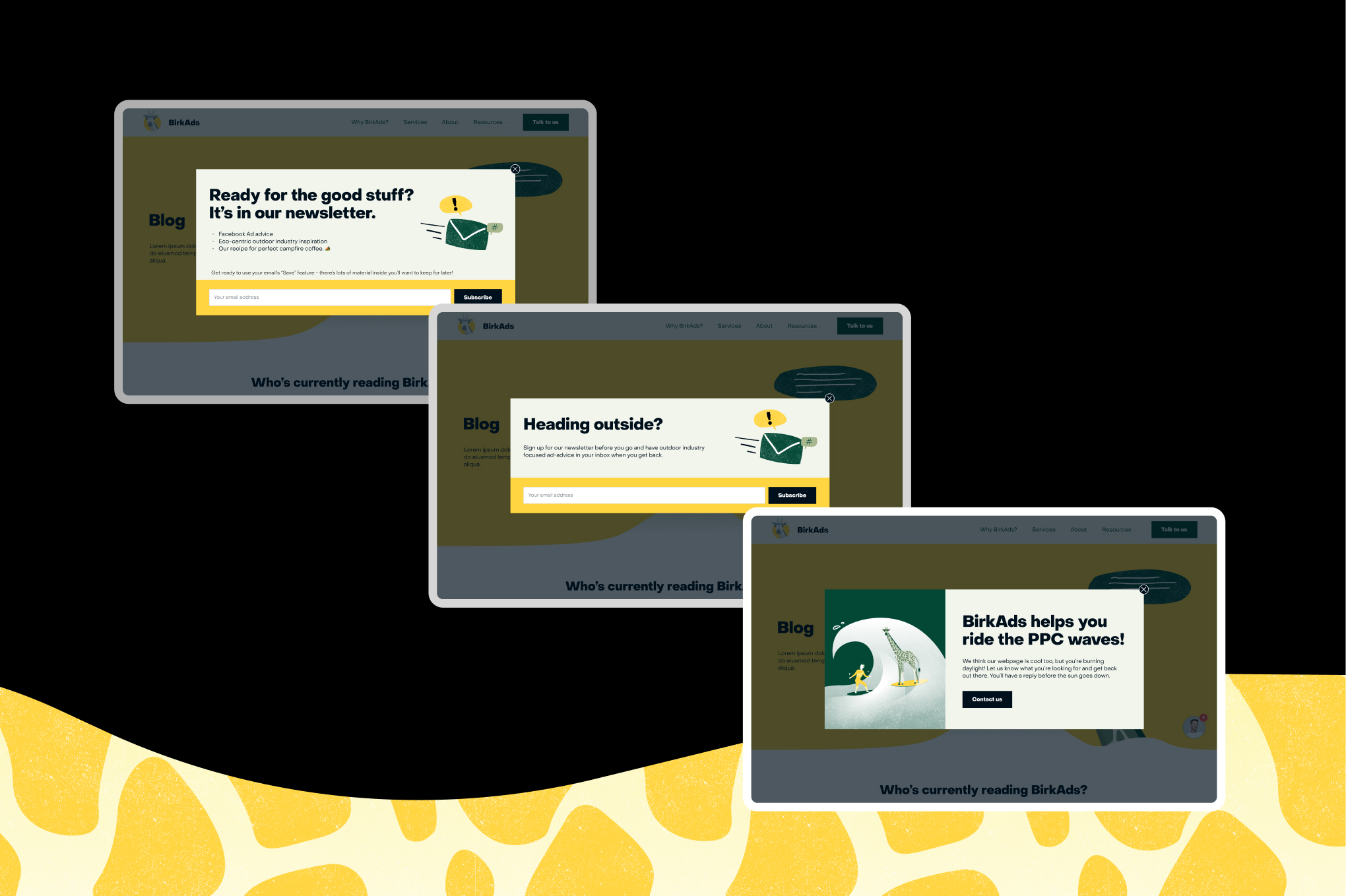
Popups:
The site features three popups: a time-spent popup, a push-to-contact popup, and a free ebook popup. Ensuring these popups were user-friendly across all devices was a significant challenge. I collaborated with Madis to refine the copy for brevity and adapted layouts for different screen sizes. Each popup was built with distinct practices in Webflow:
After observing that popups appeared too frequently, I consulted my Director to implement custom code, ensuring they displayed only once within a specific timeframe, utilising browser cache and cookies.
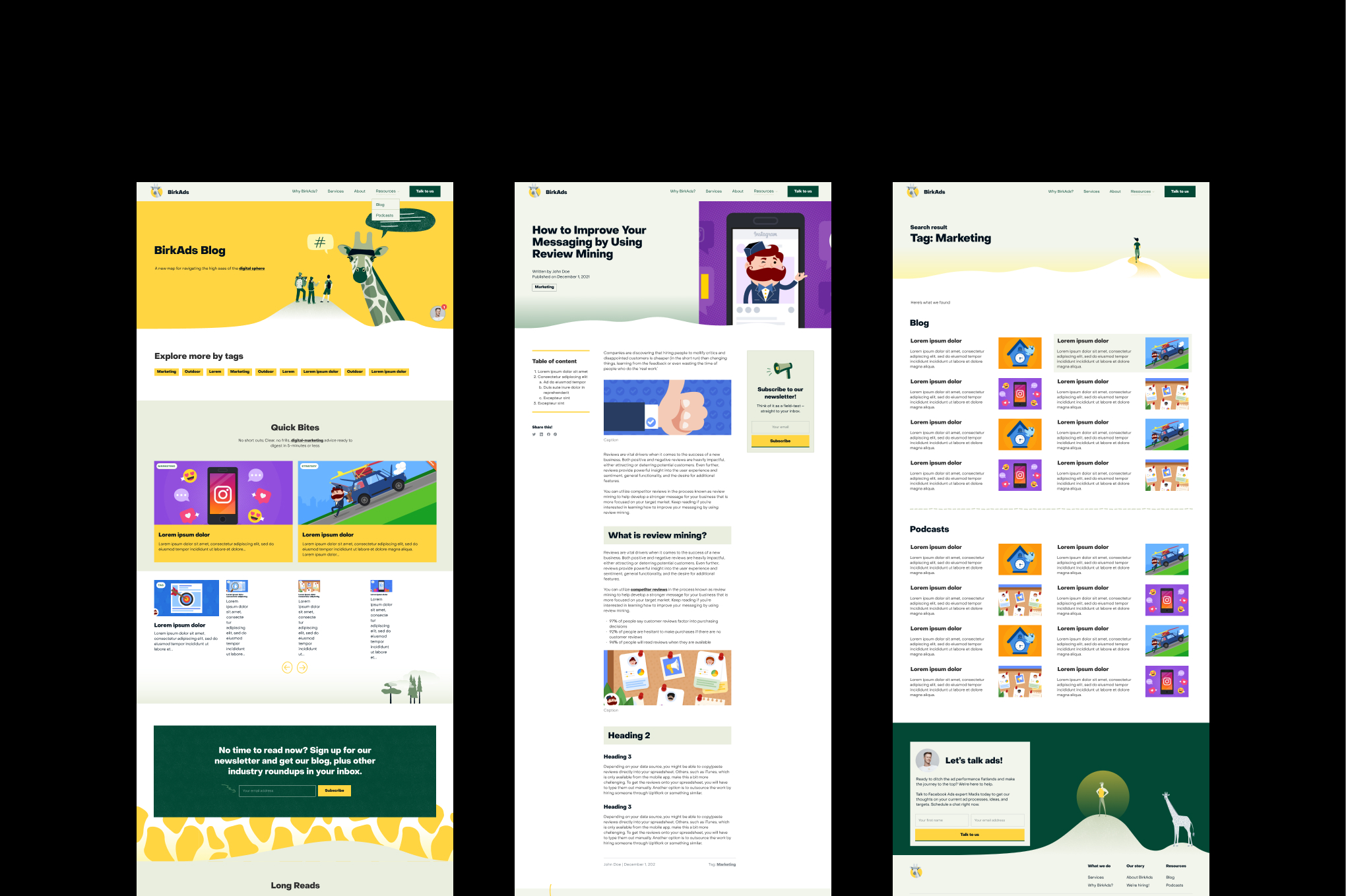
Resources (Blog and Podcasts):
BirkAds features enhanced Blog and Podcast pages, categorising content into long and short posts, with podcasts containing Spotify embeds and key quotes with timestamps. The resource pages have fixed side panels for easy navigation, including a table of contents, sharing options, and subscription CTAs.
After discussions on client needs and technical constraints, we determined that using tags for search functionality was optimal, given the volume of content produced. The Tag Search Results page allows viewers to skim blog posts and podcasts grouped by specific tags. Developing the logic to nest and connect various CMS collections posed a challenge, but we successfully implemented it.
Illustrations, Animations, and Interactions:
I designed a combination of vector illustrations, grainy textures, and scribbles using Photoshop, Illustrator, and Procreate. Subtle animations of elements such as the giraffe and human figures conveyed the brand's playful and dynamic nature. Each hero illustration serves as a page summary, with on-click and on-hover interactions for added engagement.
Challenges included ensuring responsiveness and seamless integration of illustrations, reducing loading times to enhance Google rankings, and using interactions strategically to guide users. We devised solutions from the high-fidelity mockup phase onwards, ensuring background illustrations blended seamlessly with section edges. All illustrations were resized for smaller screens and uploaded in SVG format where feasible. Micro-interactions were applied strategically to highlight key areas, such as hero sections and CTA buttons.
The BirkAds project was intensive, requiring extensive communication, meticulous planning, and a deep understanding of Webflow. I gained invaluable insights and expertise from Madis, an advertising and marketing specialist. I was delighted to see the site go live and gain visibility on the client’s social media.

